The Plan Variance Report helps you answer a simple but powerful question:
How did my actual performance compare to what I planned?
As an Individual Contributor in Bramble, your weekly plan sets expectations for how your time will translate into results. This report compares your planned performance against actual performance across key operational metrics so you can adjust, improve, and continuously refine your impact.
The report compares your actual results against the planned results derived from your weekly plan, across four core metrics:
Output - How many hours of Production Tasks were completed.
Contribution – How productive you were when working on Production Tasks (i.e. excluding any time you spent on Supporting Tasks).
Utilization – the proportion of time you spent working on Production Tasks, as opposed to Supporting Tasks such meetings, training, projects or leadership tasks.
Available Time – The time you had available to work excluding any leave and inclusive of any overtime.
By identifying variances between plan and reality, you can:
Understand where your week diverged from expectations
Diagnose whether changes were caused by availability, friction, workload allocation or unscheduled meetings, training or other supporting tasks
Improve future planning accuracy
Drive better weekly performance conversations
Because you can run the report across any date range, it’s equally useful for:
Daily huddles
Weekly reviews
Monthly reflections
Quarterly or annual performance discussions
You can access the report in two ways:
Via your Hub
Sidebar navigation:
Go to Reports → Performance → Select the Plan Variance tab
The Plan Variance Report is structured in three main sections:
Planned vs Actual Summary
Outcomes and Levers
Context & Drivers of Variance
Let’s walk through each.
The first chart you’ll see compares Planned vs Actual results across:
Output (Green) → The total hours of Production Tasks completed
Supporting (Blue) → Necessary and value-adding, this is time invested in Training, Meetings, Project or Leadership focused work
Friction (Purple) → Time lost to blockers, inefficiencies, or misalignment. This is Friction that you have self-reported via your Daily Check-Ins. Note that you do not plan for Friction so you’ll never see it appear in the ‘Plan’ element of the chart
Leave (Gold) → Total time away from work (i.e. PTO, Sick Leave)
Gap (Orange) → Unidentified time.
Available Time → The total length of the bar when all the above elements are stacked together (this will include Overtime if applicable)
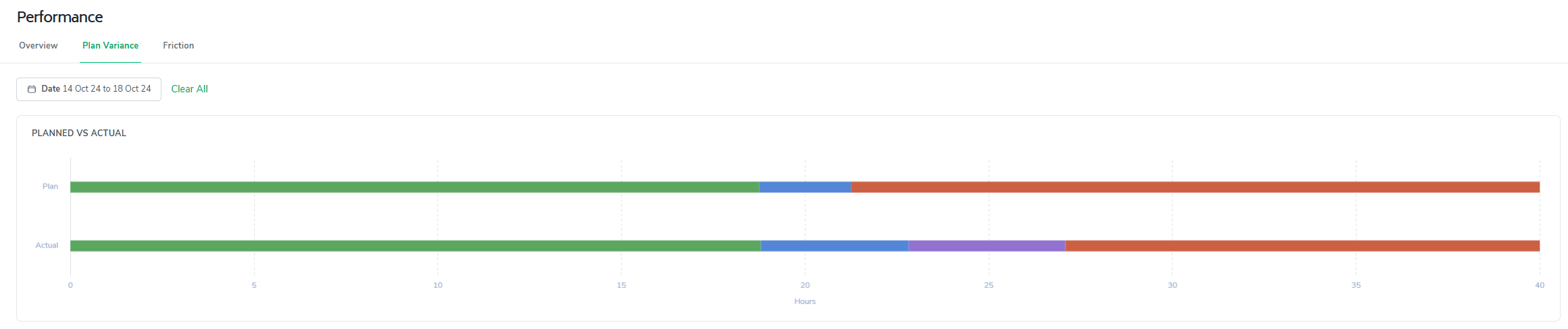
This stacked horizontal bar view gives you an immediate sense of how your week was distributed.
Each bar represents the total available time for the selected period, broken down by time type.
From the example:
Available Time appears consistent between Plan and Actual.
However, the composition of that time changed meaningfully.
The main differences are:
Supporting time increased compared to plan
Friction appeared and was reported in Bramble
Gap (unidentified time) decreased
Output remained roughly similar, with only minor variance
This visual makes it immediately clear where the shift occurred.
Below the summary chart is a metrics panel and variance visualization. Here is a screenshot example:
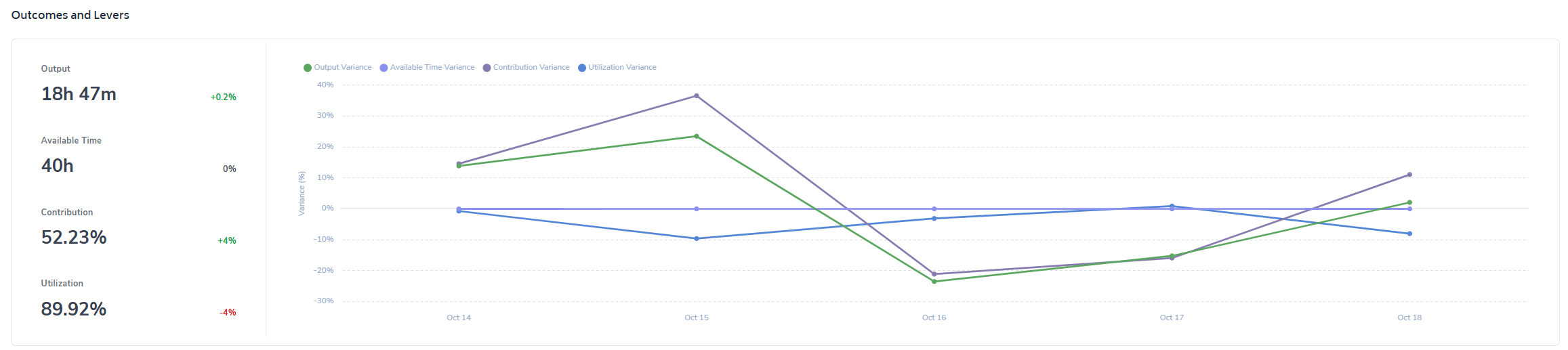
On the left, you’ll see the totals across the selected date-range for:
Output
Available Time
Contribution
Utilization
To the right of each metric is a percentage variance contrasting the actual results/performance against plan.
So if Contribution shows +4%, that means your actual contribution was 4% higher than planned - you outperformed the target you set via your Weekly Plan.
Next to the metrics is a line chart that shows:
Output Variance
Available Time Variance
Contribution Variance
Utilization Variance
…across the selected date range.
This is powerful because it shows:
Whether variance was a single-day anomaly
Or a sustained pattern
For example:
A sharp drop on one day may indicate a major blocker.
A gradual decline across days may suggest structural workload imbalance.
This helps you move from reactive to diagnostic thinking.
The bottom section of the report provides context behind the variance.
This is where the report shifts from what happened to why it happened.
It includes breakdowns across:
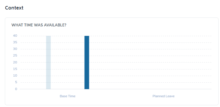
Displaying:
Base Time
Planned Leave
If Available Time variance exists, this section will clarify whether:
Leave changed
Work capacity shifted
Calendar assumptions were inaccurate
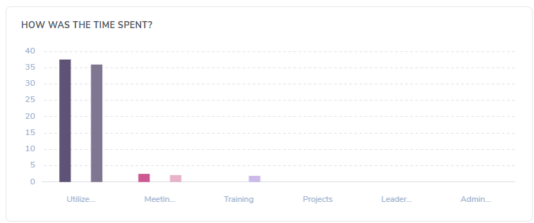
Breaks down where time was actually spent across:
Output
Meetings
Training
Projects
Leadership
Admin
This shows whether supporting tasks expanded beyond what was expected in your weekly plan.
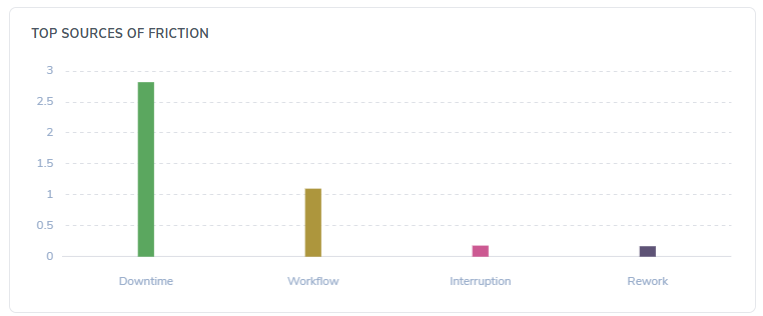
Contribution variance is often driven by Friction.
The report presents total identified friction so you can see:
How much time was lost to blockers
Where improvement opportunities exist
If Contribution is below plan but Available Time and Utilization are stable, friction is typically the lever.
Here’s a practical way to review it weekly:
Start with the Planned vs Actual summary.
Where is the largest difference?
Check Outcome Variance percentages.
Is this an availability issue?
A workload mix issue?
A friction issue?
Review the trend chart.
Was this one bad day or a structural pattern?
Use the bottom section to diagnose root cause.
Did Supporting expand?
Did friction spike?
Was leave mis-estimated?
Adjust your next weekly plan accordingly.
Rebalance Supporting expectations
Block time for Output
Proactively reduce friction sources
The Plan Variance Report closes the loop between:
Intent (your weekly plan)
and
Execution (your actual performance)
Over time, consistent use of this report will help you:
Improve planning accuracy
Increase Contribution predictability
Reduce Friction
Strengthen performance conversations
It turns planning from a static exercise into a continuous improvement system.
If you use it consistently — not just when something goes wrong — it becomes one of the most powerful tools in Bramble for personal performance ownership.