We’ve designed the Resource Overview to give you a comprehensive and accurate understanding of your time at work and where you've invested it.
The Resource Overview report can be accessed via the sidebar menu, navigate to Reports > Resources to open it.
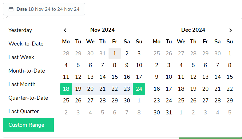
As with most reports in Bramble, you can run this report over any date-range by simply selecting the time period you'd like from the date filter:
At the top of the report, you'll find four primary metrics:
Daily Output: The average productive time per day.
Total Available Hours: The total hours you were available to work.
Total Overtime Hours: Additional hours worked beyond standard hours.
Total Leave Hours: Time taken off work.

Each metric is accompanied by a percentage indicating the change from the previous period.
This funnel chart visualizes your efficiency, breaking down your Full-Time Equivalent (FTE) status:
Total FTE
Available FTE
FTE Utilized
FTE Output
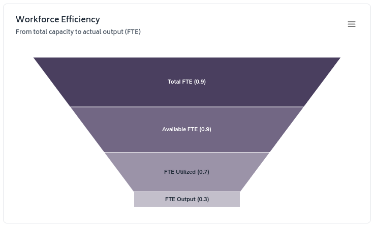
This chart helps you understand how your total capacity translates into actual output.
This line graph shows daily trends for:
Base Hours
Available Hours
Overtime Hours
Leave Hours
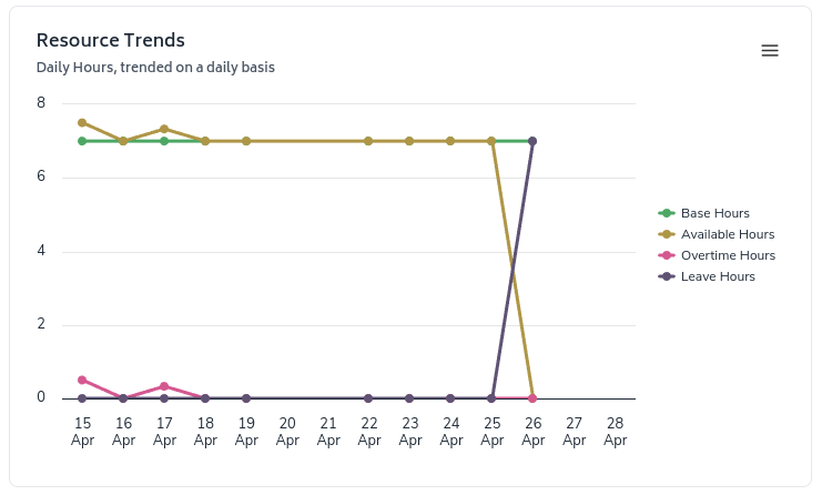
Use this chart to identify patterns in your work hours and resource allocation over time.
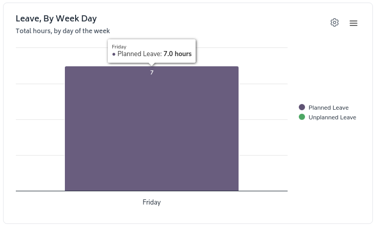
The "Leave, By Week Day" chart breaks down your leave hours by day of the week. In the example, 7 hours of planned leave were taken on Friday.
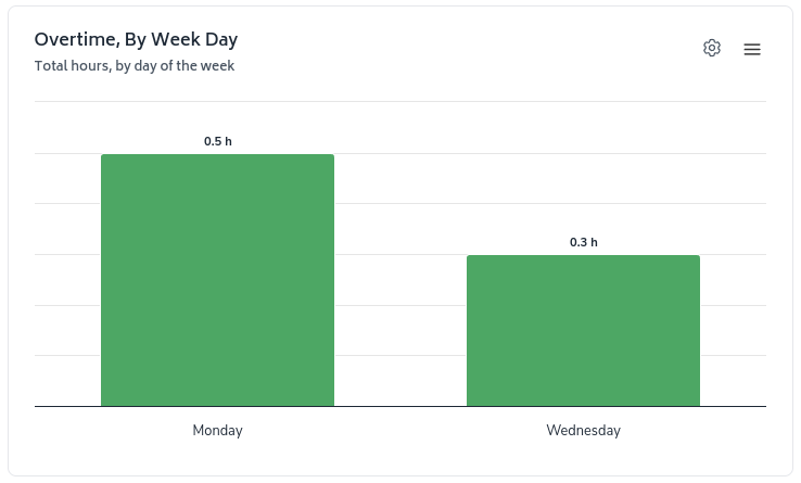
The "Overtime, By Week Day" chart shows your overtime hours by day of the week
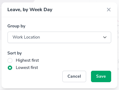
The 'configure-chart' option allows you to group by and in some cases sort highest/lowest first. This can be accessed by clicking the following icon which appears in the top-right of any relevant charts:

Clicking on it will show a screen where you can configure the grouping and sorting of a metric:
