Bramble's Workload Overview is designed to provide insight into the metrics that make up your workflow, namely:
Input - the amount of work received by your team/group
Output - the amount of work completed by your team/group
Inventory - the amount of work sitting in backlog
To access the Workload Overview via the side-bar menu, navigate to Reports > Workload.
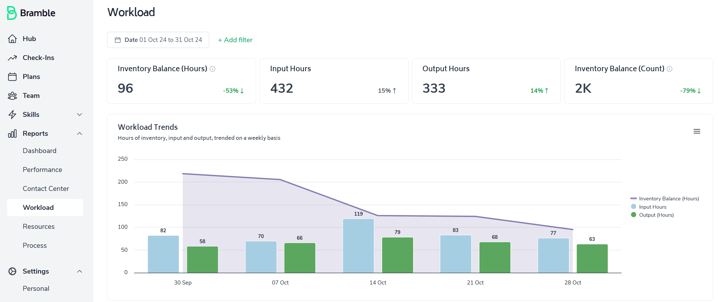
As with most screens in Bramble, this report can be run over any date-range.
Our primary metrics focus on backlog, input, and output hours rather than volume. This provides a clearer picture of workload movement and makes the data more intuitive to interpret when it comes to resource planning.
The 'top metrics' highlight, Inventory Balance (Hours), Input Hours, Output Hours and Inventory Balance (Count). All are prominently displayed for an immediate workload status snapshot:

This report includes several powerful features designed to provide deeper, more actionable insights:
Workload Trends: Shows how workload changes over time, automatically adjusting grouping based on the selected date range. Helps with resource planning and identifying patterns.

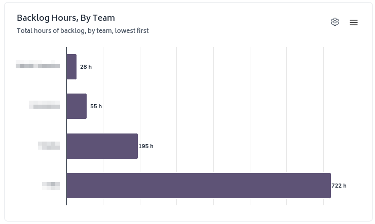
Backlog Hours: Offers a detailed view across different dimensions to quickly identify bottlenecks and allocate resources effectively.
Break down backlog by organizational unit, team, and various process dimensions.
Sort backlog hours to identify areas of highest and lowest accumulation.
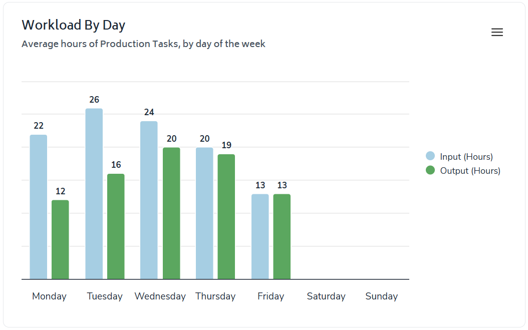
Workload by Day of Week: Compares the busiest and most productive days of the week to optimize weekly scheduling.
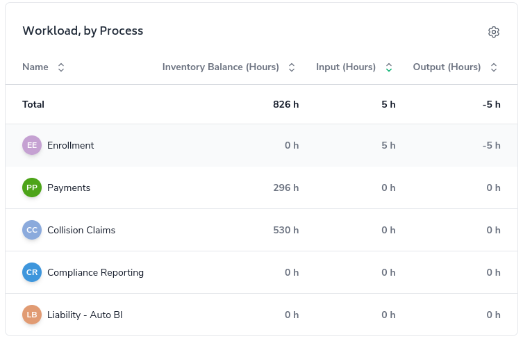
Workload Table (if running the report at a department level): A comprehensive, sortable table comparing key metrics by various organizational dimensions. Enables easy performance comparison and identification of areas needing support.
The "Add Filter" button allows you to dynamically add filters to the report. Besides the fixed date filter, only the selected filters will be visible, making them easier to understand at a glance.
When you use the interactive features, you will notice the filters are updated at the top of the page.
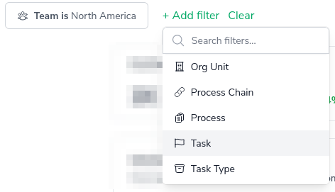
You can click on some chart elements and table rows to filter the report with more granularity. The interactive nature of the charts allows you to analyze results in greater detail at the click of a button - whenever you see the cog icon in the top-right corner of a chart/table, you are able to apply a filters to that particular chart/table.

These features work together to provide a comprehensive view of workload and inventory within your team or department, allowing you to:
Identify trends and patterns in your workload.
Spot bottlenecks and inefficiencies quickly.
Make data-driven decisions about resource allocation.
Compare performance across different dimensions of your organization.
Plan more effectively for both short-term operations and long-term strategy.