We’ve designed the Performance Overview to give you a comprehensive and accurate understanding of your performance and key drivers of it.
The Performance Overview report can be accessed via the sidebar menu, navigate to Reports > Performance to open it.
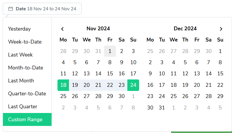
As with most reports in Bramble, you can run this report over any date-range by simply selecting the time period you'd like from the date filter:
At the top of the report, you'll find four primary metrics:

Each metric is accompanied by a percentage indicating the change from the previous period.
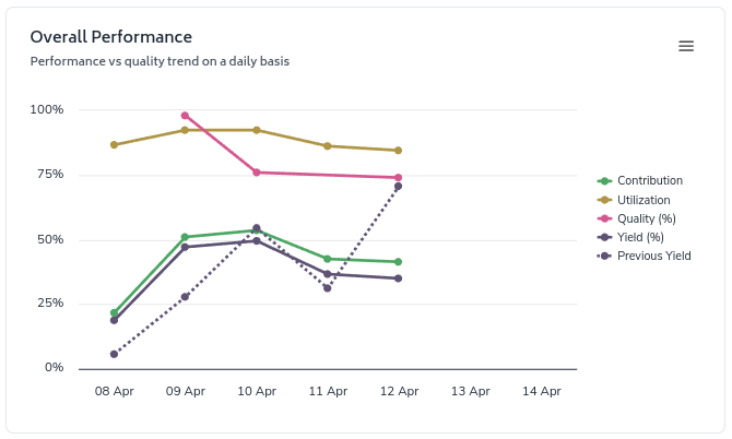
This line graph shows daily trends for Contribution, Utilization, Quality, Productivity, and Previous Yield. It helps you spot patterns and compare your current performance to past periods.
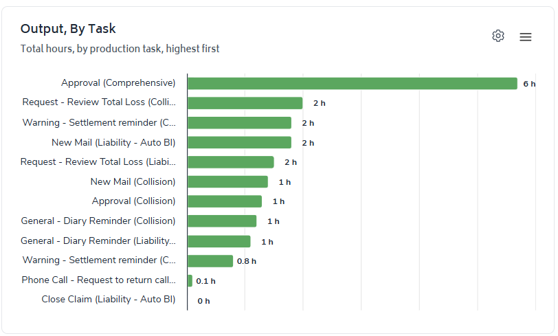
The bar chart displays the total hours of Output by Production Task. It's useful for quantifying the tasks you spent the most time working on.
The second section displays four daily metrics:
Daily Output: The average hours of Production Tasks completed.
Daily Supporting: Time spent on necessary but non-core activities.
Daily Friction: Time lost to interruptions or inefficiencies.
Daily Gap: Unaccounted time in your workday.

Each metric is accompanied by a percentage indicating the change from the previous period.
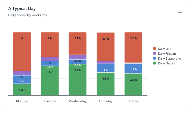
This stacked bar chart shows how your time is typically distributed across Output, Supporting, Friction, and Gap for each day of the week. Use this to identify which days are most productive or challenging.
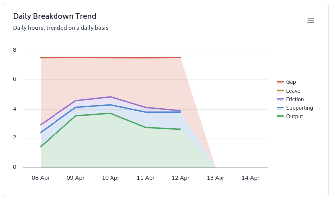
This area chart displays trends in your daily time allocation over the selected date-range. It includes Output, Supporting, Friction, Gap, and Leave.
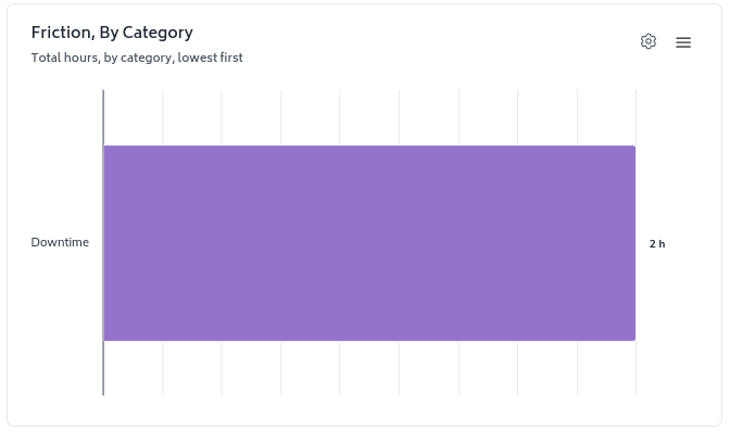
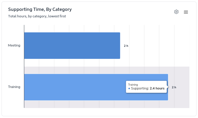
The two charts in the screenshot below are fairly self-explanatory - they present a ranking of Friction and Supporting Tasks by total hours reported via your approved Daily Check-In.
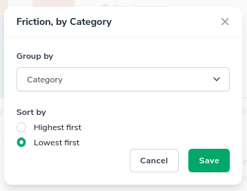
The 'configure-chart' option allows you to group by and in some cases sort highest/lowest first. This can be accessed by clicking the following icon which appears in the top-right of any relevant charts:

Clicking on it will show a screen where you can configure the grouping and sorting of a metric:
