We’ve designed the Performance Overview to give you a comprehensive and accurate understanding of resourcing and performance for both individual contributors and teams. The metrics are curated specifically ensuring that only relevant data is considered.
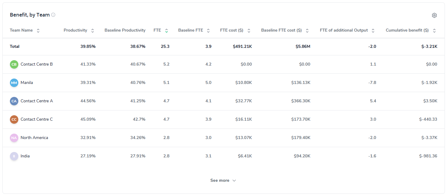
Click the following links or keep scrolling to learn more:
Starting at the top of the page you'll find an 'Add Filter' option (next to the date-range selector), it is through this feature that you are able to cut the report to any relevant filter you like.

For the Performance Overview specifically, the following filters can be applied to the entire report:
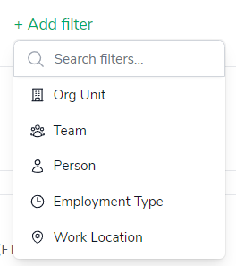
In addition, you can apply multiple filters too by simply continuing to add filters via the 'Add filter' button, in the example below, the report has been filtered to display metrics limited to only full-time employees in the 'North America' team:

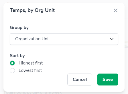
The 'configure-chart' option allows you to group by and in some cases sort highest/lowest first. This can be accessed by clicking the following icon which appears in the top-right of any relevant charts:

The Organizational Unit filter when selected will immediately toggle the report from an aggregate view of the relevant resource metric to a breakdown by each team that report up to the particular org unit you are viewing.
It can be accessed by clicking on the 'Cog' button and selecting the appropriate options from the drop-down menus, the screenshot below illustrates selecting a view of the Temps Chart by Organization Unit, then sorting by highest to lowest:
Before we go over the reporting elements, you can click on a chart element to filter the report with more granularity. The interactive nature of the charts allow you to analyze results in greater detail at the click of a button.
Let's take a look at each of the charts...
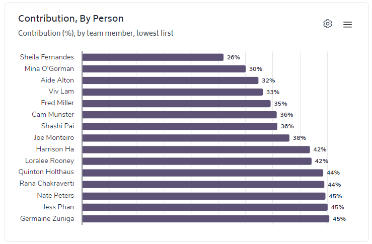
The first element you'll notice is the leaderboard for Contribution. It defaults to presenting by Person, and ranking lowest to highest; but can be changed to display Team or Org by clicking the cog icon:
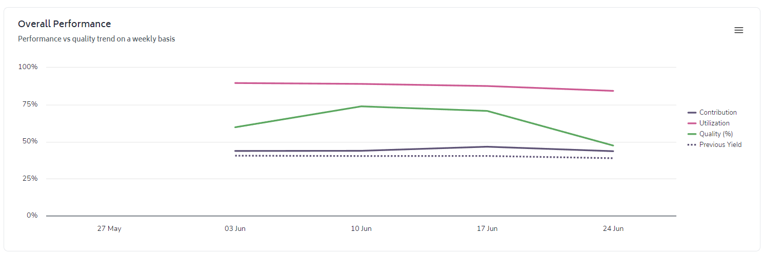
The 'Overall Performance' chart shows the trended metrics - Contribution, Utilization, Quality, and previous period Productivity (represented with a dotted line) - the aim is to contextualize current performance:
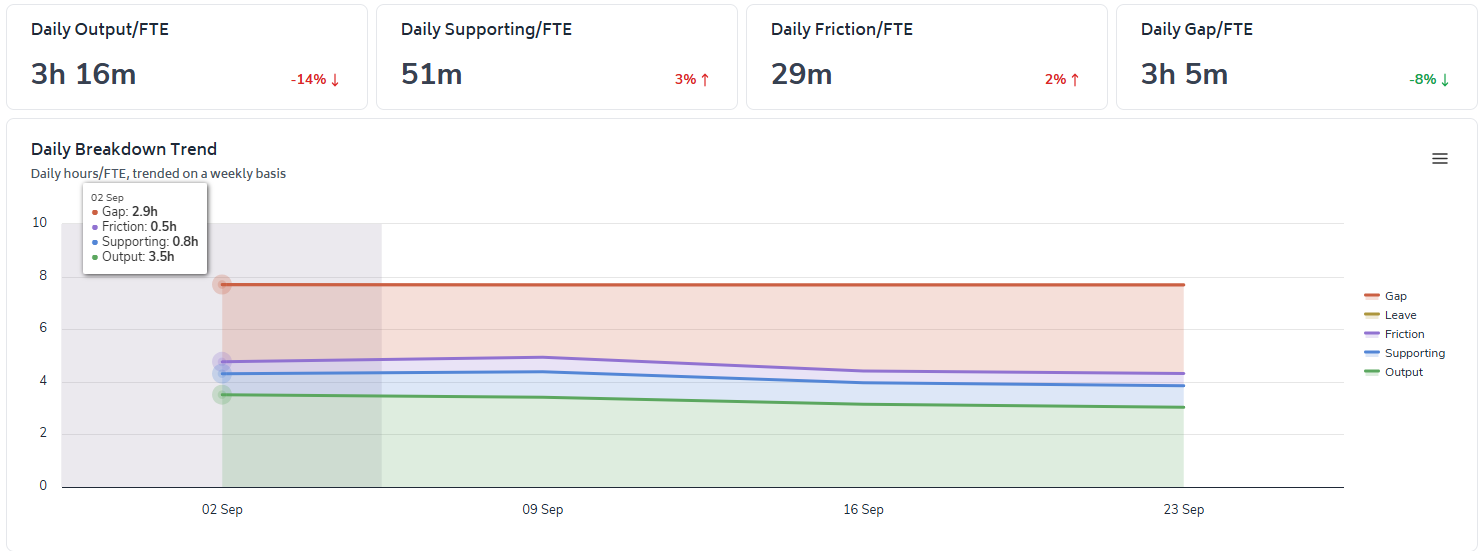
Displays the trended and summarized view of where time is being spent per person, per day; from the following categories:
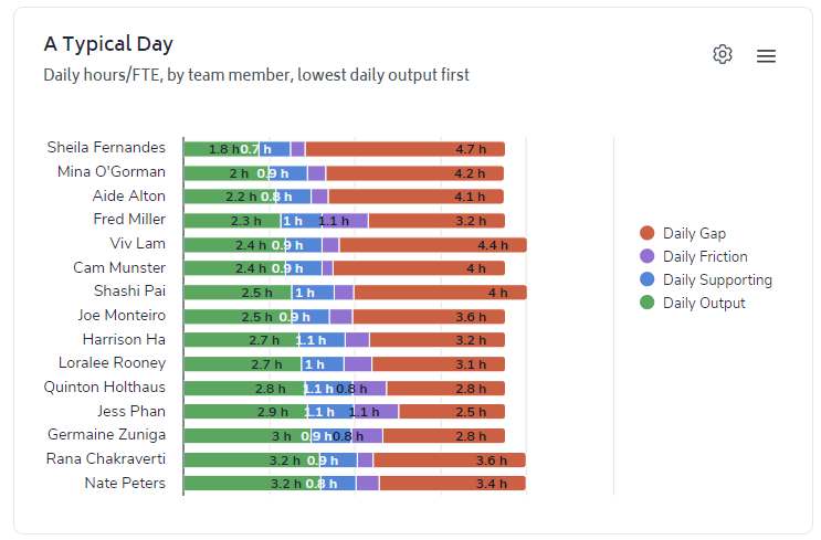
The 'Typical Day' chart displays an average profile of where time has been spent over the date-range selected:
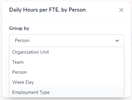
Again, this chart defaults to filtering by team member, however via the cog icon you can change the filter to any of the following:
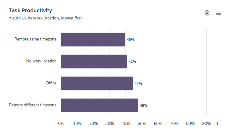
The 'Task Productivity' chart displays the average Productivity by a range of options. You'll notice that it defaults to work location, however like all other charts, the cog icon leads you to the range of filters you can apply.
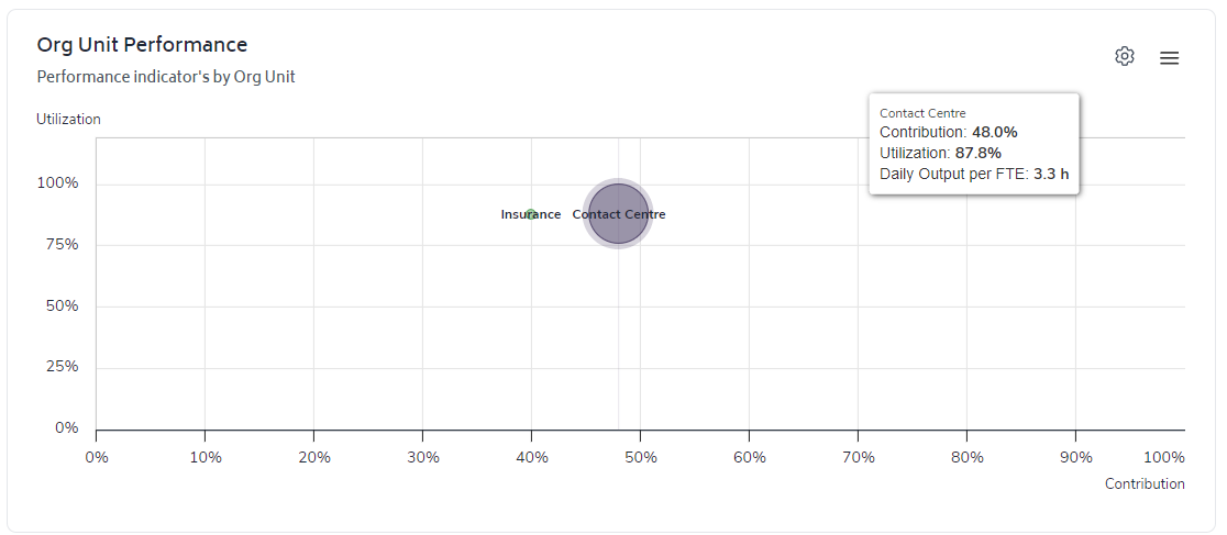
The 'Org Unit Performance' bubble-chart displays actual Utilization on the y-axis and the actual Contribution on the x-axis. The size of the bubble represents the average daily output per FTE:
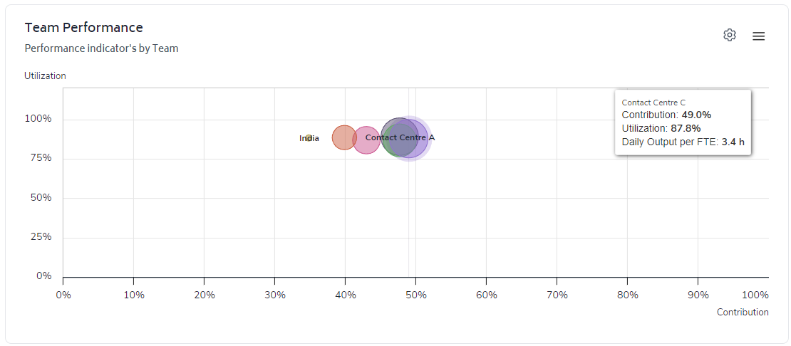
You can filter between displaying the results for the Organizational Unit or by Team. The screenshot below displays the chart after I have changed the filter to display results by team:
The 3 charts in the screenshot below are fairly self-explanatory - they present a ranking of Production Tasks, Friction and Supporting Tasks by total hours:

Again, the cog icon in the top-right of the chart area will lead you to the various filters you can apply and the option to select ranking based on 'high-to-low' or 'low-to-high'.
Finally, the table at the bottom of the report allows you to quickly review metrics at the level of the organizational tree that report up to the team/department you have selected to run the report for - with the enhanced interactivity (outlined below), if you wish to drill-down onto a specific team or department within the table, you simply need to click on it:

The table can be filtered (via the cog icon) to display results for:
Organizational Unit
Team
Team member