The Friction Report is located alongside Performance reports and has been designed to give you a comprehensive and accurate understanding of the Friction your frontline staff are encountering.
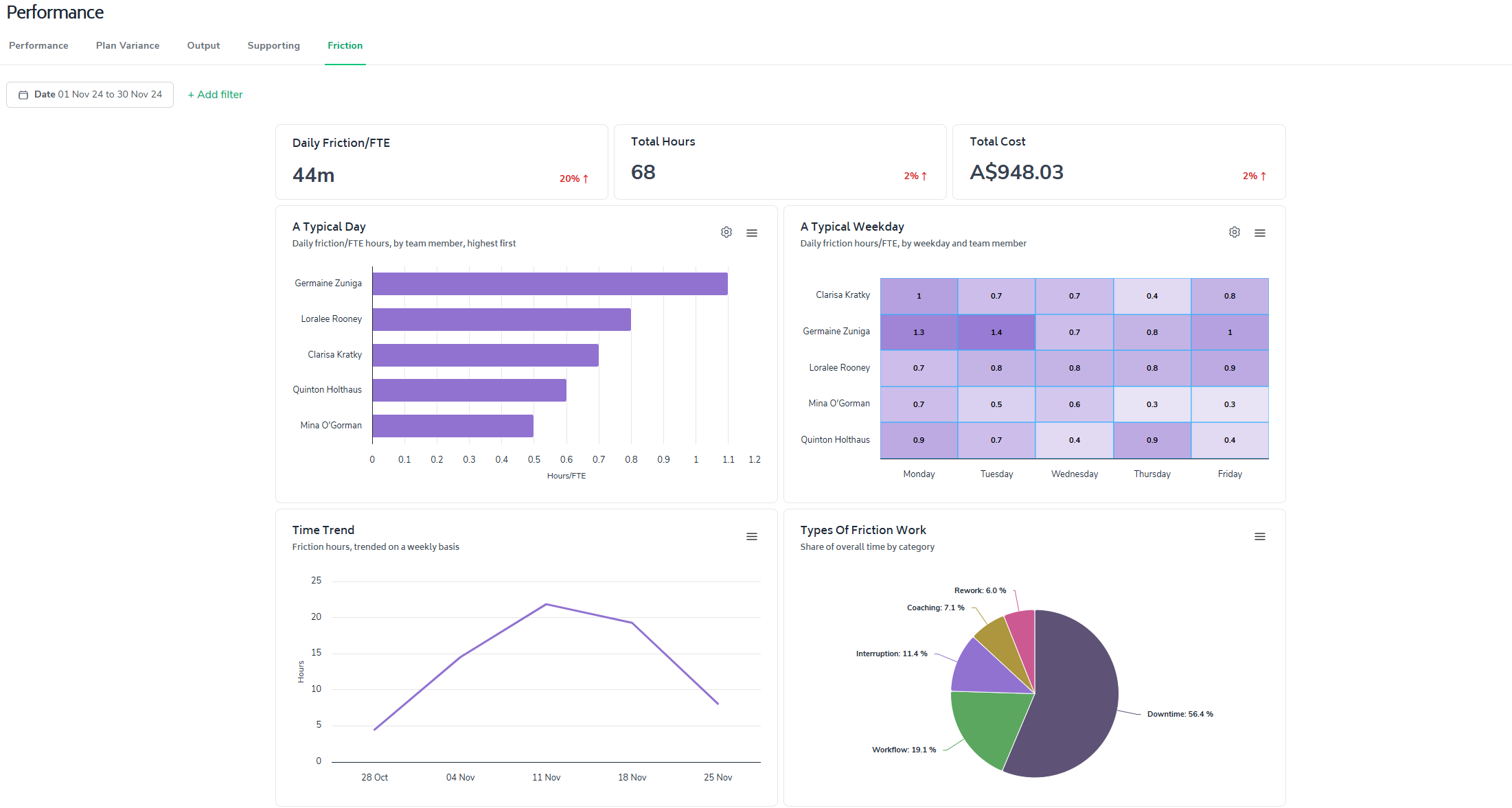
The metrics are curated ensuring that only relevant data is considered, allowing users to:
Compare friction levels across different employment types
Analyze patterns in friction across different work locations and days of the week
Track trends in friction hours over time
Understand the distribution of friction across different categories (e.g., downtime, interruptions, workflow issues)
Identify the most time-consuming and costly types of friction
Break down friction impacts by organizational unit
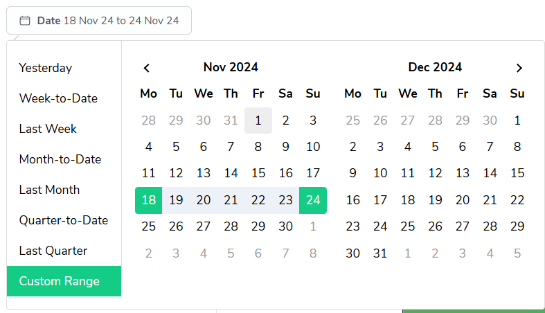
As with most reports in Bramble, you can run this report over any date-range by simply selecting the time period you'd like from the date filter:
This guide will walk you through the key metrics and features of this report.
The report prominently displays three essential metrics to give you an immediate snapshot of friction in your team's workflow:
Daily friction hours per Full-Time-Equivalent (FTE)
Total friction time
Total cost of friction
These metrics provide a clear, intuitive understanding of how friction is affecting your team's productivity and the costs associated with the loss of productive time.
The report presents the following view of Friction by department, team or team member:
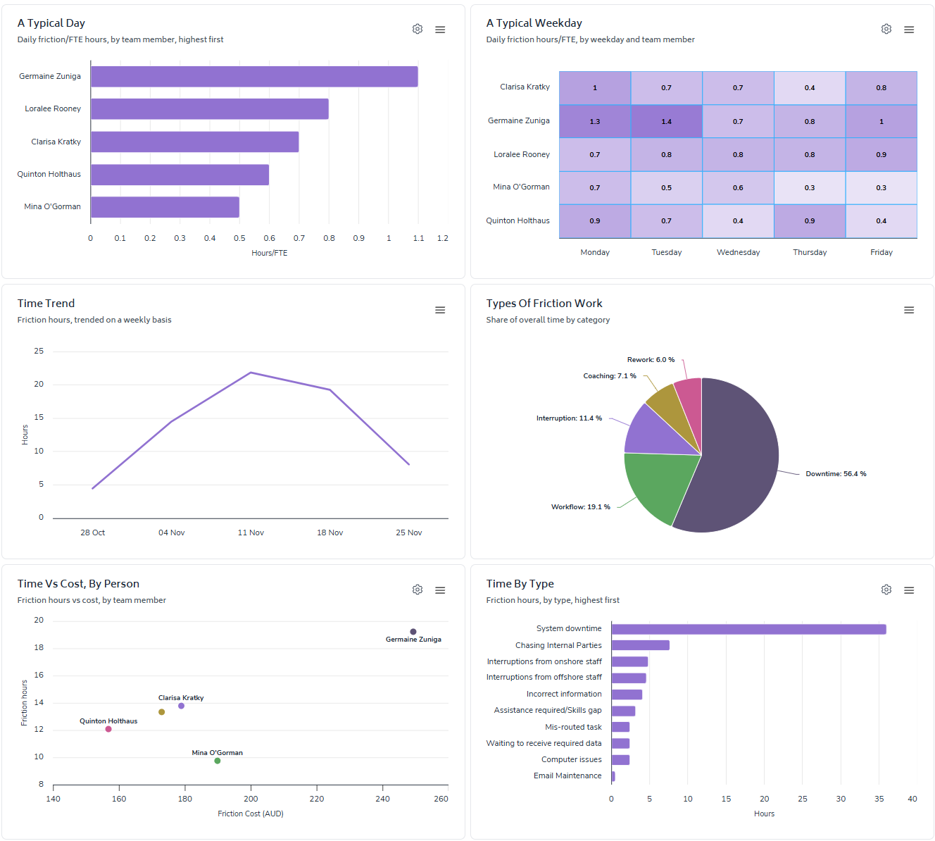
A Typical Day
Bar chart showing daily friction hours/FTE by employment type
Quickly identify how friction affects different areas (customizable - e.g. org units/teams/people/categories)
A Typical Weekday
Heat map displaying daily friction hours/FTE by weekday and work location
Understand patterns in friction across different areas (customizable)
Time Trend
Line graph tracking friction hours on a weekly basis
Spot patterns and trends in friction over time
Types of Friction Work
Pie chart breaking down the share of overall time by friction category
Easily visualize the distribution of friction across different areas (customizable)
Time vs Cost, By Category
Scatter plot comparing friction hours to friction cost by category
Identify which types of friction are most costly to your organization
Time By Type
Bar chart showing friction hours by specific friction types
Quickly identify which friction points are consuming the most time
Detailed breakdown
Table breaking down friction hours and costs by areas (customizable)
Gain a detailed view of how friction is distributed across your organization
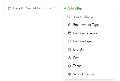
You can filter the report by utilizing any of the elements listed in the '+Add filter' drop-down (pictured below) - this will help you quickly dive deeper into the Friction data.
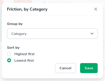
The 'configure-chart' option allows you to group by and in some cases sort highest/lowest first. This can be accessed by clicking the following icon which appears in the top-right of any relevant charts:

Clicking on it will show a screen where you can configure the grouping and sorting of a metric:
