The Output Report is located alongside Performance reports and has been designed to give you a comprehensive and accurate understanding of the Production Tasks your staff are completing.
The metrics are curated ensuring that only relevant data is considered, allowing users to:
Identify top-performing teams or locations
Spot inefficiencies in task allocation
Identify seasonality on the level of Output completed
Optimize resource distribution based on output and cost data
Track productivity trends over time
Make data-driven decisions to improve overall operational efficiency
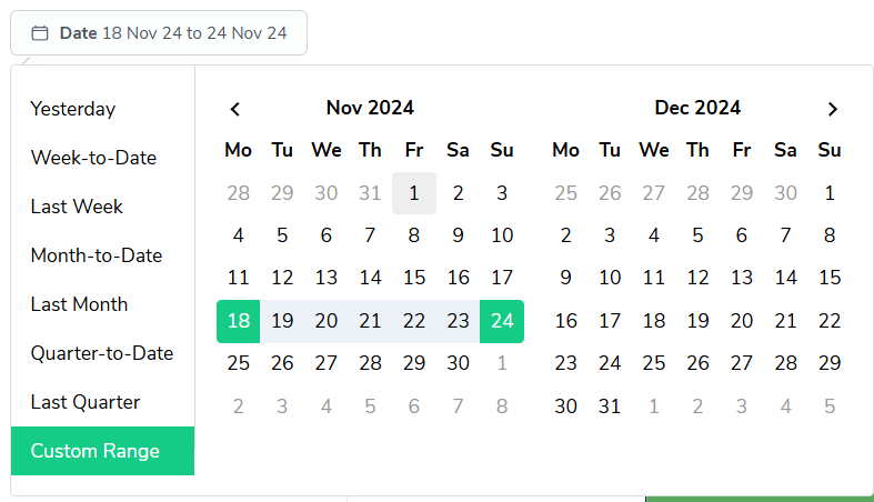
As with most reports in Bramble, you can run this report over any date-range by simply selecting the time period you'd like from the date filter:
This guide will walk you through the key metrics and features of this report.
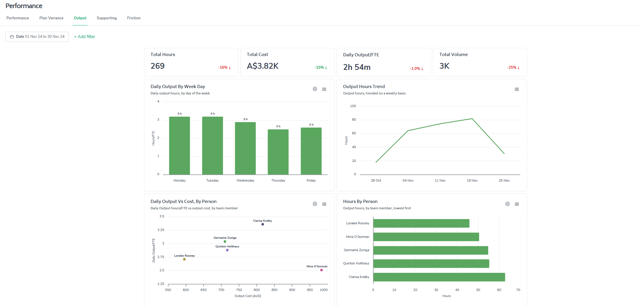
The report prominently displays four essential metrics to give you an immediate snapshot of your team's output over the selected date-range:
Total Output Hours
Total Cost (of producing the Output)
(Average) Daily Output per FTE
Total Output Volume

These metrics are designed to provide a clear, intuitive understanding of your team's productivity.
The percentages presented in the bottom-right corner of each card represent the variance when comparing the selected date-range against the most recent historical period. For instance, if you run the Output report over 1-month, the variance presented will display the changes compared to the previous month.
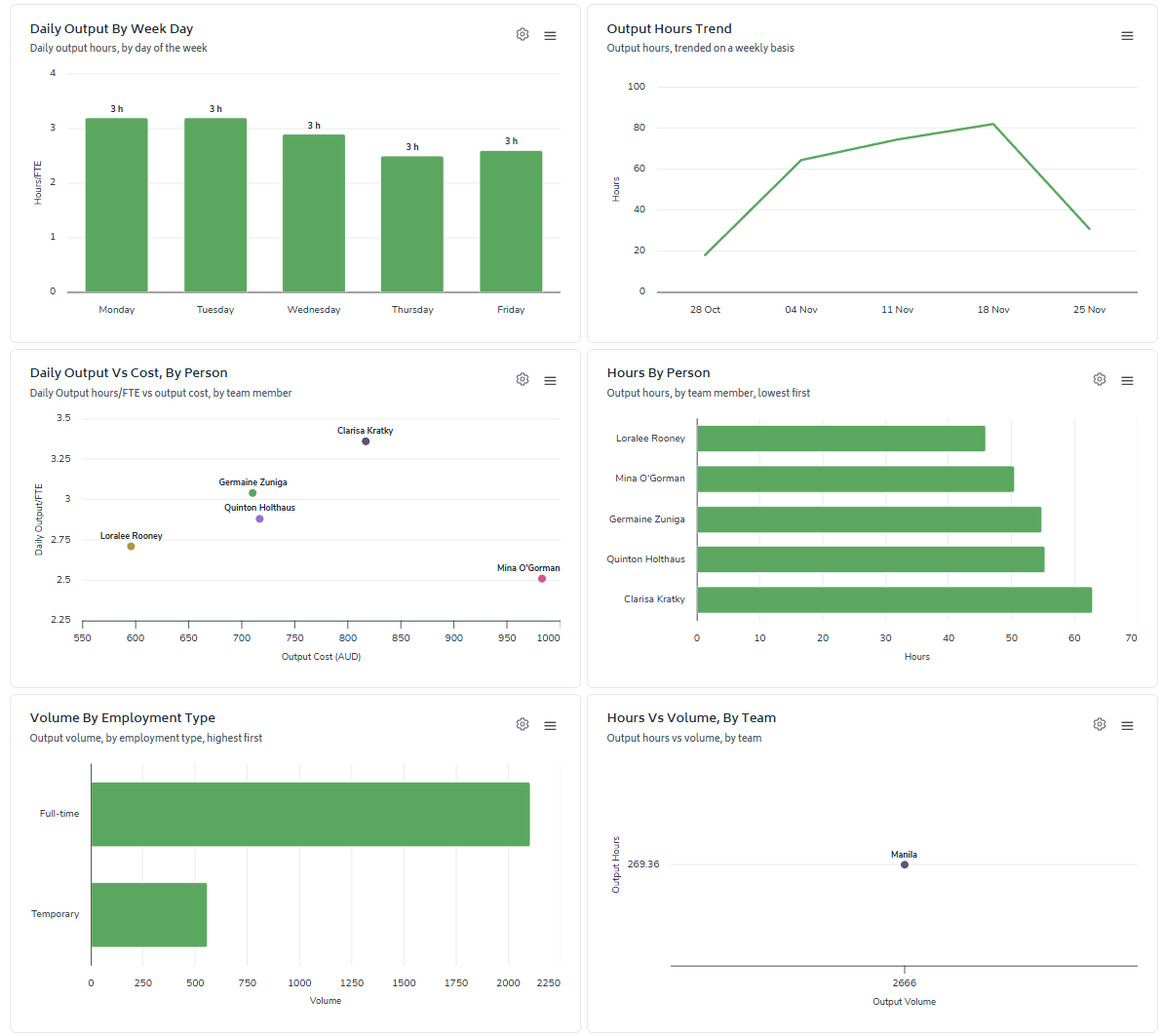
Daily Output Bar Chart
Customizable grouping by team, day-of-week or location dimensions
Quickly identify high-performing days and areas for improvement
Output Hours Trend
Track output hours over time to spot patterns and long-term trends
Helps in resource planning and identifying seasonal variations
Output vs. Cost Scatter Plot
Visualize the relationship between daily output and associated costs
Identify optimal productivity-cost balance points
Hours and Volume Bar Charts
Customizable by team/location and task dimensions
Compare output across different organizational units or task types
Hours vs. Volume Scatter Plot
Highlight tasks with high volume but low output hours
Identify potential areas for process optimization or automation
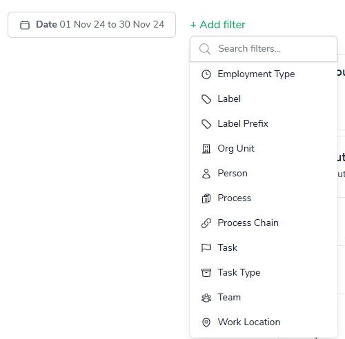
You can filter the report by utilizing any of the elements listed in the '+Add filter' drop-down (pictured below) - this will help you quickly dive deeper into the Output data.
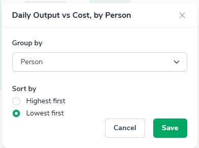
The 'configure-chart' option allows you to group by and in some cases sort highest/lowest first. This can be accessed by clicking the following icon which appears in the top-right of any relevant charts:

Clicking on it will show a screen where you can configure the grouping and sorting of a metric:
Two charts on this page, 'Hour By ...' and 'Volume By ...', also contain additional grouping filter:
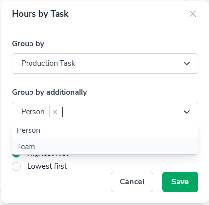
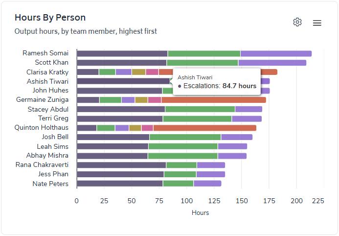
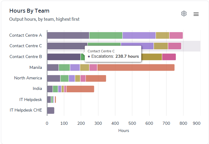
This allows you to view the breakdown of the bars in the chart and not just the totals. Once selected in either chart, the bar will then be broken down to display the 'top 5' and other for each task or person depending on the filtering.
Eg.
View the people or teams with most hours of output on a given task:
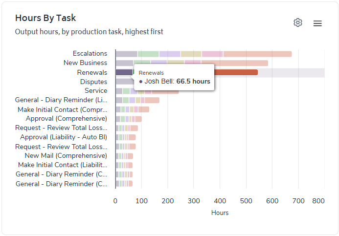
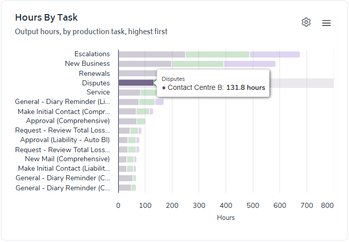
Or, view the tasks that are making up you people's or team's output:
