The Supporting Report is located alongside Performance reports, making it easy to explore related concepts and metrics in your productivity module, but is solely focused on Supporting Tasks.. The metrics are curated specifically through the team member and team lenses, ensuring that only relevant data is considered, allowing users to:
Identify team members who are spending the most time on supporting activities
Analyze patterns in supporting work across different days and employee types
Track trends in supporting hours over time
Understand the distribution of supporting work across different categories
Compare the efficiency of supporting activities across teams
Identify which supporting tasks are the most time-consuming
Break down supporting efforts and costs by organizational unit
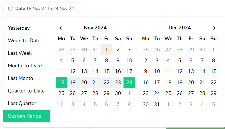
As with most reports in Bramble, you can run this report over any date-range by simply selecting the time period you'd like from the date filter:

This guide will walk you through the key metrics and features of this report.

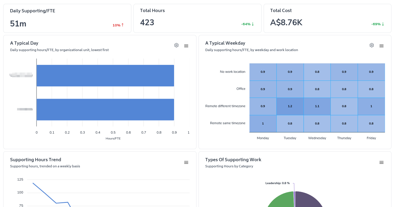
The report prominently displays three essential metrics to give you an immediate snapshot of your team's supporting activities:
Daily Supporting hours per FTE
Total Supporting Hours in the selected period
Total Supporting Cost
These metrics provide a clear, intuitive understanding of your team's supporting efforts and their associated costs.
A Typical Day
Bar chart showing daily supporting hours/FTE by a customizable area (e.g. Unit, Team, Person, Weekday)
Quickly identify individual utilization and workload distribution
A Typical Weekday
Heat map displaying daily supporting hours/FTE by weekday and a customizable area/grouping
Understand patterns in supporting activities across different employee categories and days of the week
Supporting Hours Trend
Line graph tracking supporting hours on a daily basis
Spot patterns and trends in supporting activities over time
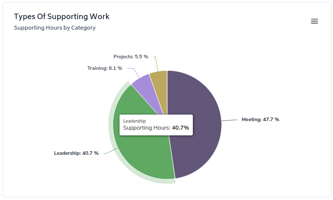
Types of Supporting Work
Pie chart breaking down supporting hours by category
Easily visualize the distribution of effort across different types of supporting work
Daily Supporting vs Cost, by selected area
Scatter plot comparing daily supporting hours/FTE to supporting cost by team
Identify areas that may be over or under-utilizing resources due to supporting activities
Hours by selected area
Bar chart showing supporting hours by selected areas
Quickly identify which supporting activities are consuming the most time
Detail, by selected area
Table breaking down supporting hours and costs by organizational unit
Gain a detailed view of how supporting efforts are distributed across your organization

Each visualization includes options to expand, filter, or customize the view, allowing you to dive deeper into specific aspects of your supporting data.

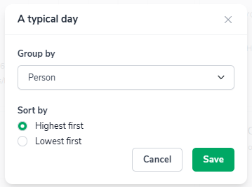
The 'configure-chart' option allows you to group by and in some cases sort highest/lowest first. This can be accessed by clicking the following icon which appears in the top-right of any relevant charts:

Clicking on it will show a screen where you can configure the grouping and sorting of a metric:
