This Supporting Report consolidates key metrics associated with Supporting Tasks to provide a holistic view of your supporting activities so you can:
Analyze patterns in supporting work across different days and work location
Track trends in supporting hours over time
Understand the distribution of supporting work across different categories
Identify which supporting tasks are the most time-consuming
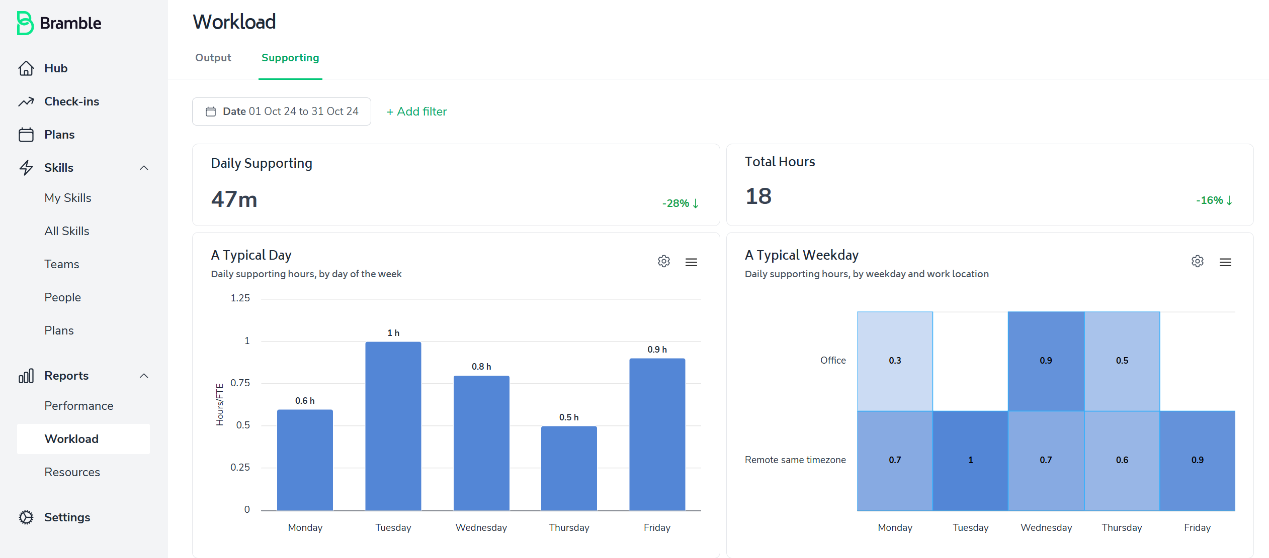
The Supporting Tasks report can be accessed via the side-bar menu under Reports > Workload, and then toggling to the 'Supporting' tab:

As with most Bramble reports, this dashboard can be run over any date-range.
The report prominently displays two essential metrics to give you an immediate snapshot of the time you've invested in Supporting Tasks:
Daily Supporting - the daily average time on Supporting Tasks over the selected date-range
Total Supporting Hours - the total time on Supporting Tasks over the selected date-range
These metrics are designed to provide a clear, intuitive understanding of your supporting efforts.
A Typical Day
Bar chart displaying daily supporting hours by a customizable area (e.g. Work location, Weekday)
A Typical Weekday
Heat map displaying daily supporting hours by weekday and a customizable area/grouping
Understand patterns in supporting activities across different categories and days of the week
Supporting Hours Trend
Line graph tracking supporting hours on a daily basis
Spot patterns and trends in supporting activities over time
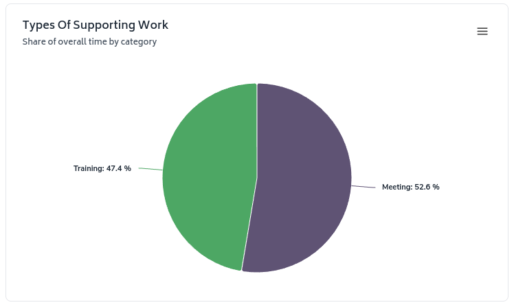
Types of Supporting Work
Pie chart breaking down supporting hours by category
Easily visualize the distribution of effort across different types of supporting work
Time by selected area
Bar chart showing supporting hours by selected areas
Quickly identify which supporting activities are consuming the most time

Each visualization includes options to expand, filter, or customize the view, allowing you to dive deeper into specific aspects of your supporting data. There are two ways to customize the report:
Apply a filter to the all elements of the report by simply clicking on '+Add filter' and selecting your preference:

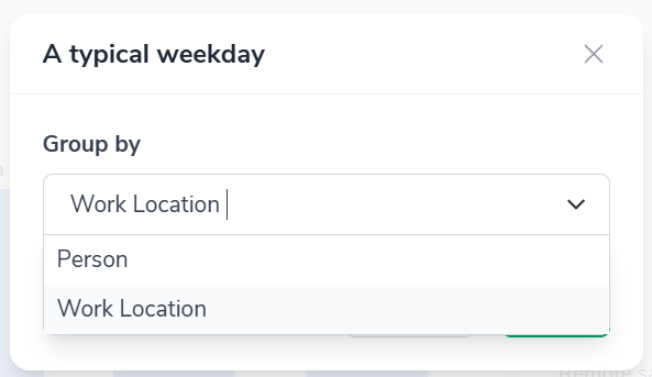
Any chart which has a cog icon in the top-right corner allows you to filter the view a variety of different ways. Simply click on the cog and select your preferred view from the drop-down:

....then you will see options pop-up. Here is a screenshot of the options associated with the 'A Typical Weekday' chart:
