We’ve designed our Process - Overview report to give you a comprehensive and accurate understanding of processes while also identifying and quantifying Continuous Improvement opportunities within the current process.
At the top of the report, you'll find four key metrics:

Process Cost: Previously Unit Cost, the total cost associated with your processes, displayed in your currency.
Key Tasks: The number of primary tasks completed during the selected period.
Resource Hours/Key Task: The average time spent on each key task.
Lean Opportunity Cost: The potential cost savings if processes were optimized
Each metric is accompanied by a percentage indicating the change from the previous period. This appears in the bottom-right corner of each key metric card.
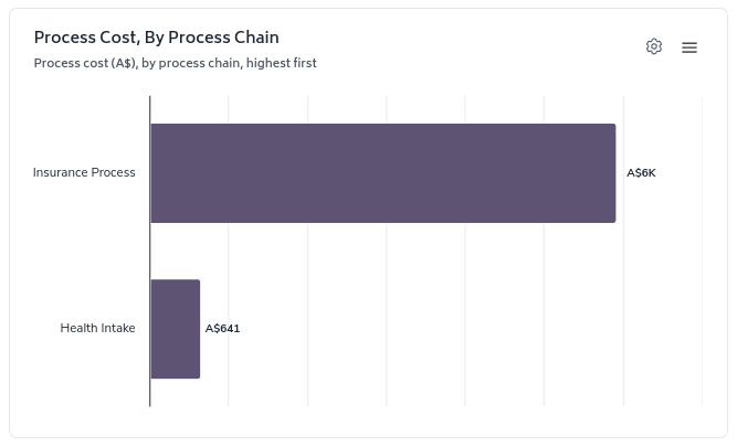
This bar chart breaks down the process cost by different process chains, ordered from highest to lowest. It helps you identify which processes are the most costly.
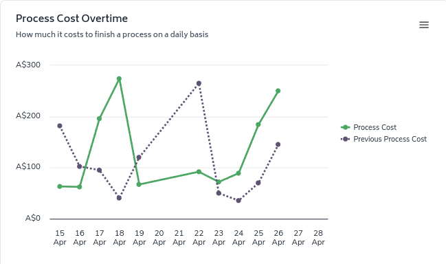
This line graph shows the daily process cost over time, comparing it with the previous period. Use this to spot trends or anomalies in your process costs.
The second section of the report displays four important efficiency metrics:

Lean Task Hours/Key Task: The time spent on value-adding activities per key task.
Opportunity Hours/Key Task: The potential time savings per key task.
Lean Opportunity: The percentage of time that could be optimized.
Touches/Key Task: The average number of interactions required to complete a key task.

This line graph compares the Team Productivity against the Lean Opportunity (potential for process improvement) over time. It helps you understand whether inefficiencies are more related to people or processes.
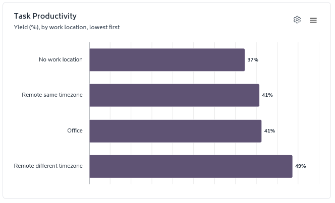
This bar chart shows the yield across different work locations. Use this to compare productivity between office, remote, and other work arrangements.
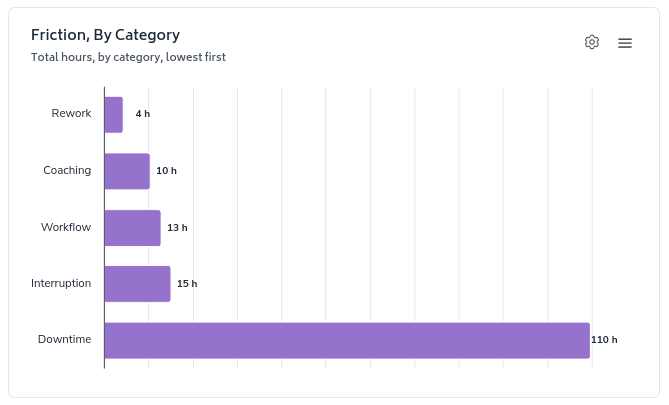
This horizontal bar chart displays the time lost to various types of friction in your processes.
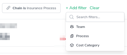
The "Add Filter" button allows you to dynamically add filters to the report. Besides the fixed date filter, only the selected filters will be visible, making them easier to understand at a glance.
When you use the interactive features, you will notice the filters are updated at the top of the page.
The 'configure-chart' option allows you to group by and in some cases sort highest/lowest first. This can be accessed by clicking the following icon which appears in the top-right of any relevant charts:

It can be accessed by clicking on the 'Cog' button and selecting the appropriate options from the drop-down menus, the screenshot below illustrates selecting a view of the Process Cost Chart by Process Chain, then sorting by highest to lowest:
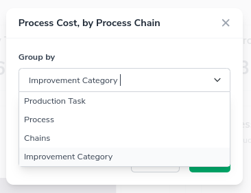
Leading to the chart updating from this...

to this...
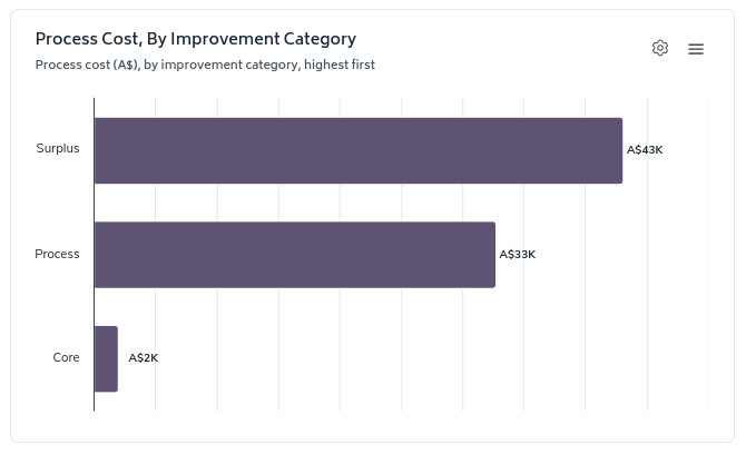
If you do change any of the configuration options on any of the applicable charts, Bramble will remember that configuration the next time you access the page so you don't have to apply them again.