The Resource - Overview report provides you with a comprehensive and accurate understanding of resourcing and performance for both individual contributors and teams.
The metrics are curated specifically through the teammate and team lens, ensuring that only relevant data is considered.
The report can be accessed via the sidebar menu by navigating to Reports > Resources.
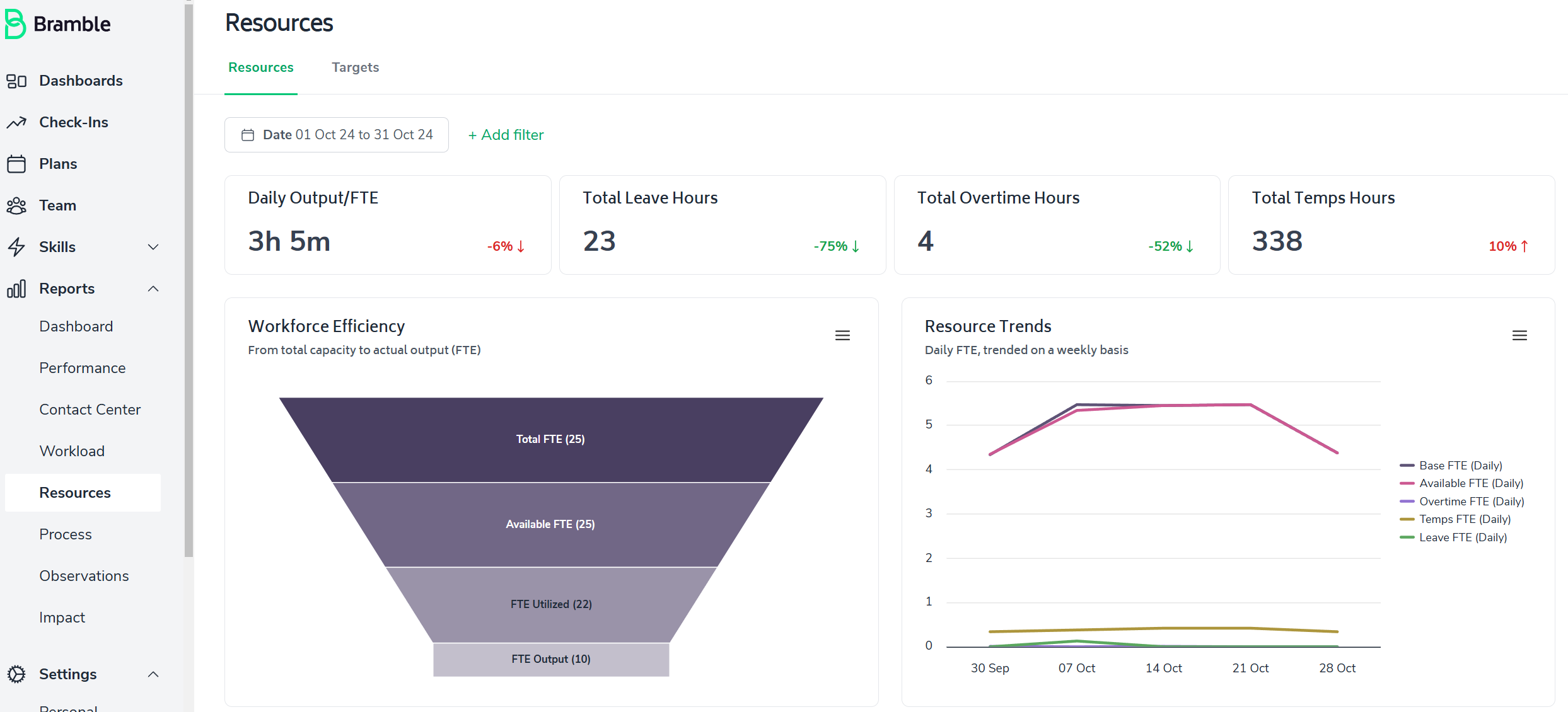
Finally, the report can be run over any date-range.
At the top of the report, you'll find four primary metrics:
Daily Output per FTE: The average output of Production Tasks per FTE per day expressed in hours.
Total Available Hours: The total hours your team or team member worked over the selected date-range.
Total Overtime Hours: Additional hours worked beyond standard hours.
Total Temp Hours: Time worked by temporary team members.

Each metric is accompanied by a percentage indicating the change from the previous period. For instance, if you've run the report for Q2 these indicators will provide you with the variance when compared to Q1.
This funnel chart visualizes efficiency by breaking down your team's Full-Time Equivalent (FTE) status:
Total FTE - the FTE assigned to your team
Available FTE - the FTE assigned to your team excluding Leave, and adding Overtime
FTE Utilized - the time spent working on Production Tasks (the gap between Available FTE and FTE Utilized is the time spent on Supporting Tasks
FTE Output - the level of Output (Production Tasks) completed by your team.
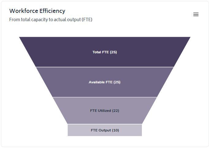
This chart helps you understand how your total capacity translates into actual output.
This line graph shows daily trends for:
Base Hours
Available Hours
Overtime Hours
Leave Hours

Use this chart to identify patterns in your work hours and resource allocation over time
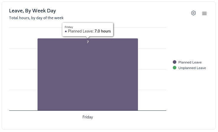
The "Leave, By Week Day" chart breaks down your leave hours by day of the week. In the example, 7 hours of planned leave were taken on Friday.
Overtime and Temps are split into their own separate charts, allowing for more targeted filtering:

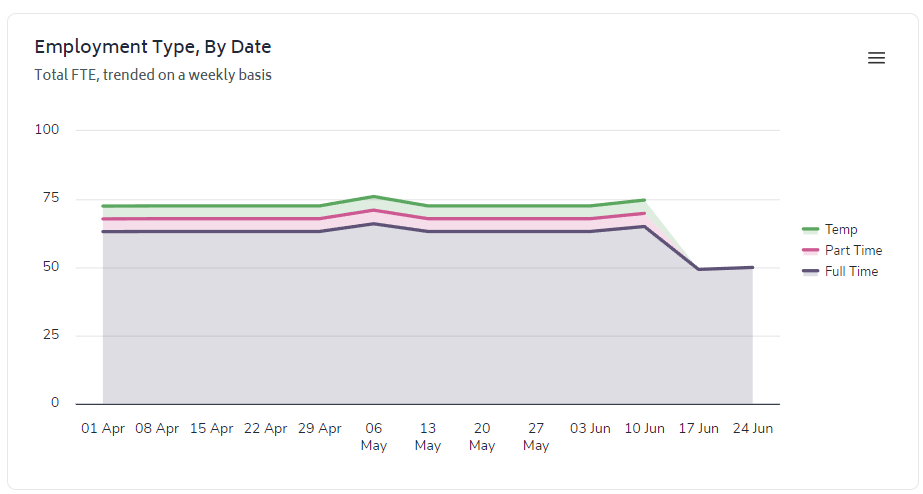
The 'Employment Type, By Date' chart trends FTE over time by Full-time, Part-time and Temps - providing a view of movement within your employee breakdown:
The FTE table allows you to quickly review metrics at the level of the organizational tree that report up to the team/department you have selected to run the report for. If you wish to drill-down onto a specific team or department within the table, you simply need to click on it:

The 'Add Filter' option towards the top of the report (next to the date-range selector) enables you to cut the report to any relevant filter you like.

For the Resources Overview report, the following filters can be applied to the entire report:
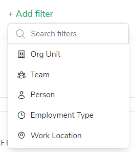
You can apply multiple filters too by simply continuing to add filters via the 'Add filter' button, in the example below, the report has been filtered to display metrics limited to only full-time employees in the 'North America' team:

The 'configure-chart' option allows you to group by and in some cases sort highest/lowest first. This can be accessed by clicking the following icon which appears in the top-right of any relevant charts:

The Organizational Unit filter when selected will immediately toggle the report from an aggregate view of the relevant resource metric to a breakdown by each team that report up to the particular org unit you are viewing.
It can be accessed by clicking on the 'Cog' button and selecting the appropriate options from the drop-down menus, the screenshot below illustrates selecting a view of the Temps Chart by Organization Unit, then sorting by highest to lowest:
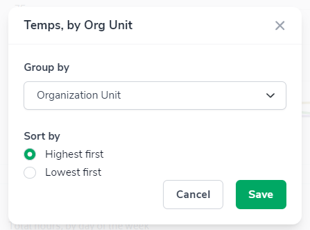
Leading to the chart updating from this...
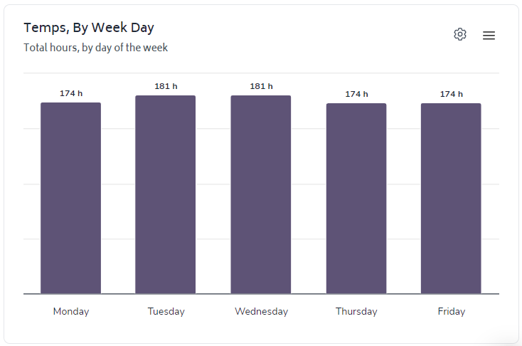
to this...
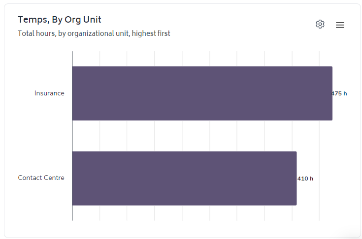
You can click on a chart element to filter the report with more granularity. The interactive nature of the charts allow you to analyze results in greater detail at the click of a button.